DCS Technologies.
An established engineering identity, carried forward into a refreshed website and supporting visual system.
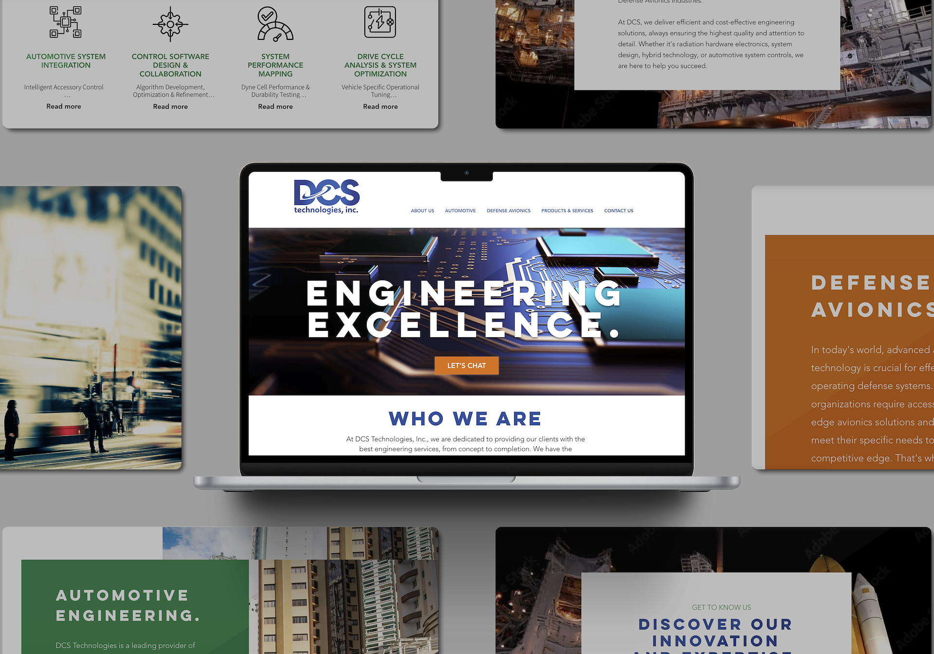
Keep what works. Refresh what surrounds it.
My relationship with DCS Technologies began years before the website project, when the company needed visual communication materials to support its growing business. I contributed to its early brand development and later created a brand reference guide. When the opportunity arose to work on the website, the goal was to build on the established identity rather than start over.
The work focused on how the brand showed up around it: page composition, typography, industry-specific imagery, and clearer visual organization across engineering and technology services.
This case study documents the work through surviving design presentations rather than claiming measured performance results.
Consistency beyond a single screen.
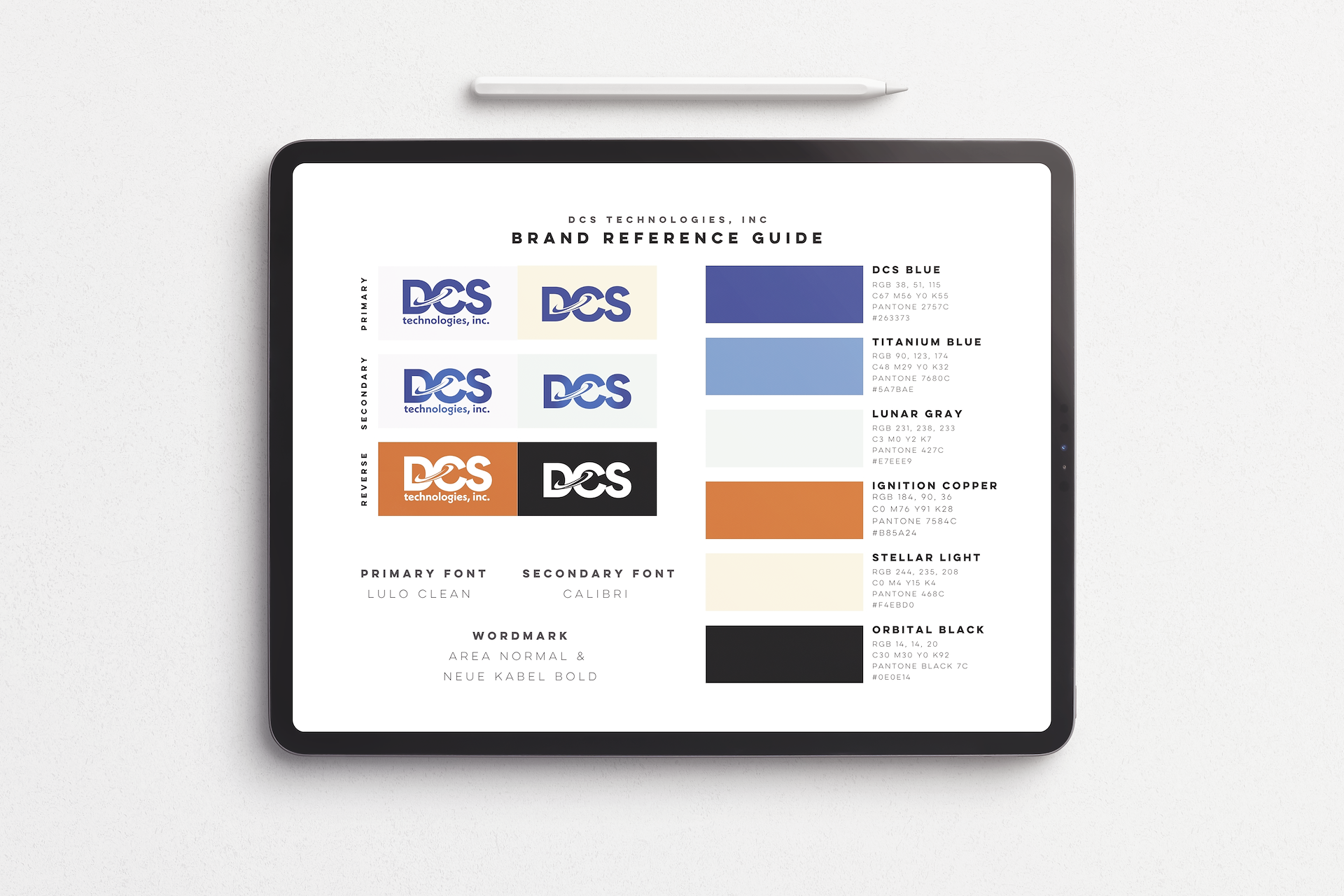

Recognizable, without standing still.
Preserving the established mark gave the refreshed digital presentation a connection to what came before. The design work was not about inventing a new identity for its own sake, but helping an existing one function in a different context.
The early identity materials and the brand reference guide show how I explored consistent applications of the established identity. Additional development was envisioned, but the work did not progress into a second phase.
Thinking beyond the screen.
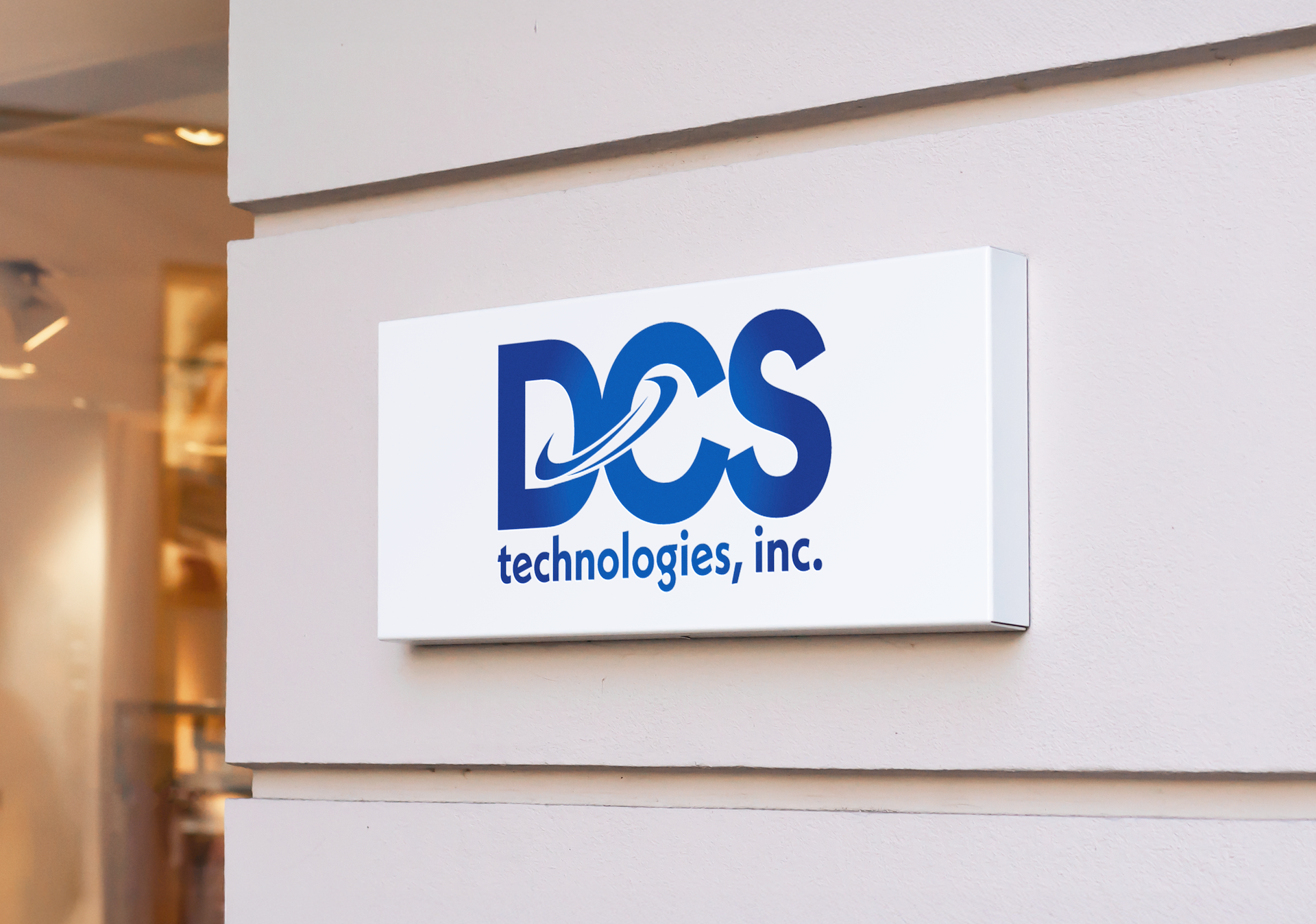
The signage presentation explores how the established logo might look in an architectural setting.
Concept mockup · Not installed signage
It's included as an example of environmental brand exploration, not as a completed installation.
Good brand stewardship sometimes means knowing what to keep.
This project reflects an approach I value: understanding an established identity, making considered creative decisions, and extending a visual language through new applications without losing its continuity.
Back to selected work