One brand.
Many ways to tell its story.
I brought a strong print and visual communication background to Oak Street Funding, but serving as its sole in-house designer meant working across far more than one discipline. From December 2014 to February 2021, I shaped the company’s visual communications across publications, campaigns, websites, digital marketing, events, and sales materials. I moved between creative direction and hands-on execution, often in the same day.
Oak Street Funding is an Indianapolis-based financial services company providing specialty financing to insurance businesses, investment advisors, and accounting firms for growth, acquisitions, and ownership transitions. As Creative Brand Manager and Art Director, I built strong working relationships with sales teams, writers, leadership, and other stakeholders to turn business needs into clear, consistent creative work. I also selected and hired freelance designers when needed, directed their work, and reviewed it for quality and brand consistency.
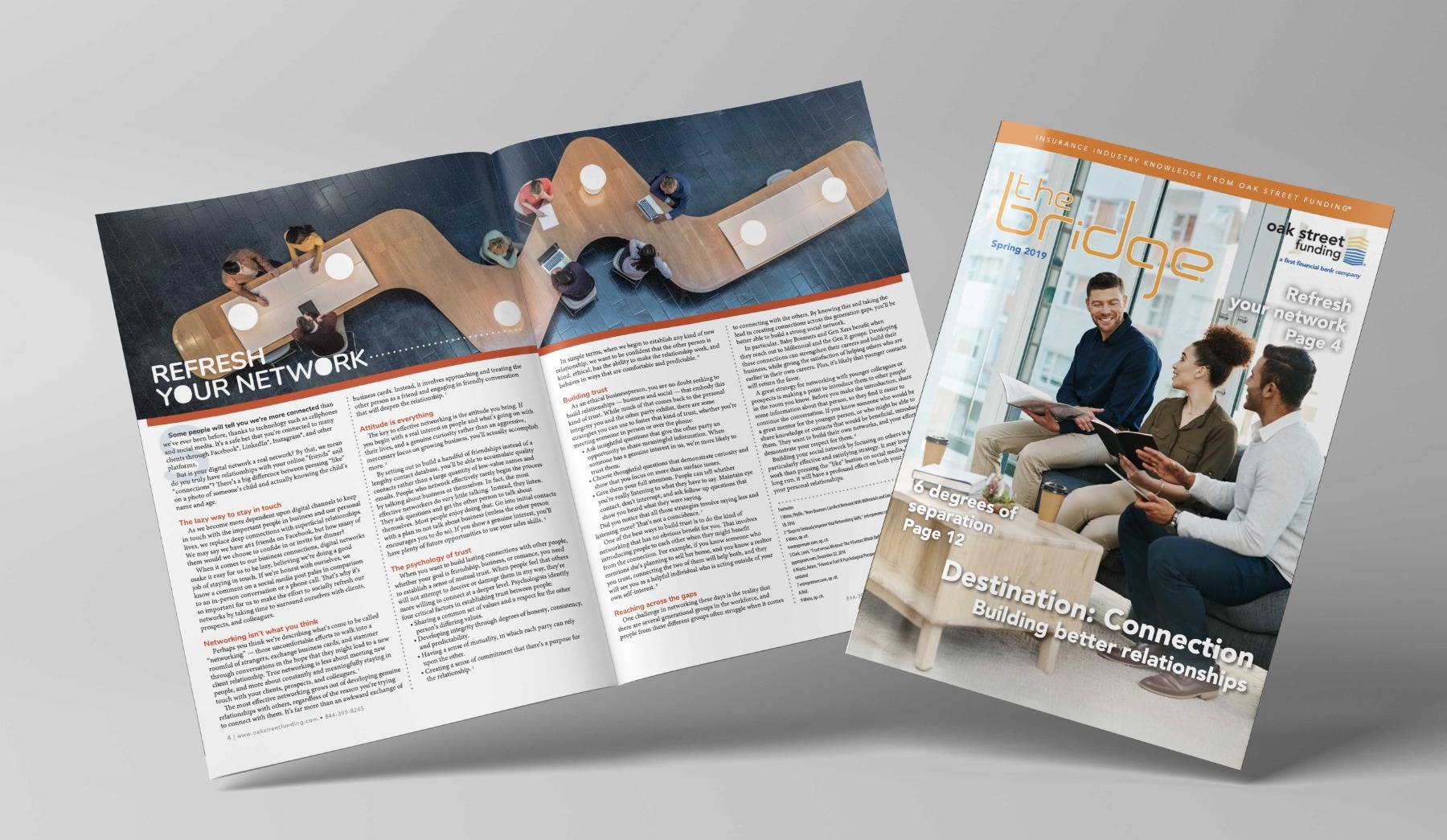
A publication with a story to tell.
The Bridge was a quarterly publication, typically 12 or more pages. Each issue called for a new balance of stories, pacing, and visual clarity. I art-directed and designed it, working with writers on the content and printers on the final production.
It was not a one-off assignment. The rhythm of creating issue after issue made it an important part of how Oak Street stayed connected with its audience.
Recognition: 2016 American Inhouse Design Award for The Bridge Newsletter · Graphic Design USA (GDUSA), July 2016.
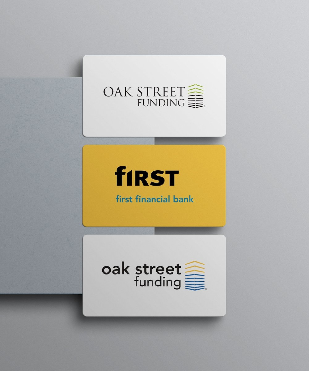
From audit to alignment.
When Oak Street became part of First Financial Bank, the question was how to bring two visual identities into alignment without losing what customers recognized about Oak Street. I led that design effort.
I reviewed existing communications, studied the parent company’s brand system, and worked with stakeholders to develop the refreshed visual direction. Then I guided the rollout across updated materials, vendor coordination, and production.
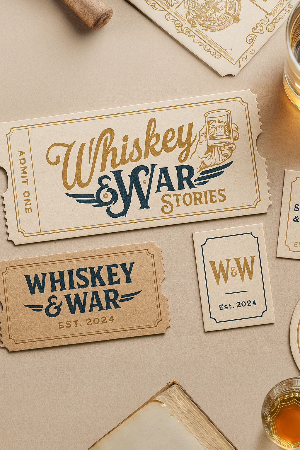
Honoring service through design.
For Whiskey & War Stories, a corporate event honoring military heroes and first responders, I created an identity and supporting collateral with a more expressive, tactile character. The typography and materials were chosen to feel respectful of the people and stories at the center of the event.
The value of seeing it through.
What stays with me is how much of the work happened between the designs: listening, building trust, solving problems, and getting the details right. The pace could be demanding, but that experience taught me to bring the same care to the people and the process as I did to the finished work.
Back to selected work